Client Spotlight: MeSo Healthy Brand Development & Packaging Design in San Diego
Cultivating a Scalable Wellness Brand
CLIENT SPOTLIGHT
MESO HEALTHY
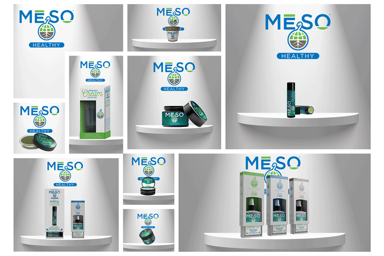
During our partnership with Meso Healthy, we stepped in to provide foundational brand identity and hands-on creative direction for their team of designers. When this vertically integrated CBD company needed to launch seamlessly across online and physical retail, they trusted our vision to deliver impactful brand touchpoints—whether it was through developing over 30 custom product packages, launching engaging event campaigns, or designing the massive trade show displays, signage, and apparel for their Earth Day title sponsorship at Balboa Park.
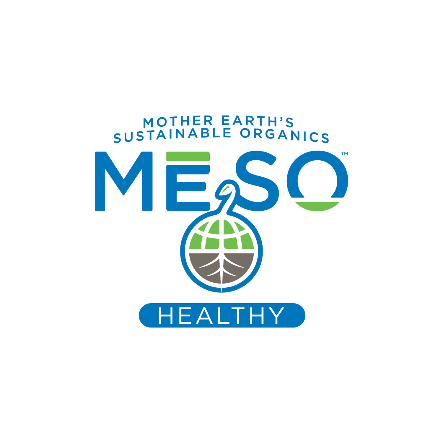
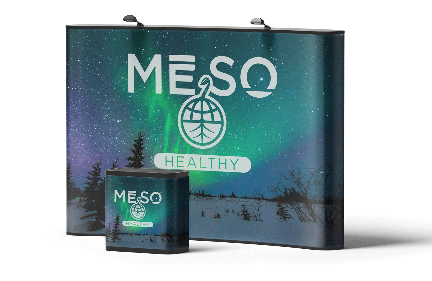
MeSo Healthy Corporate Identity
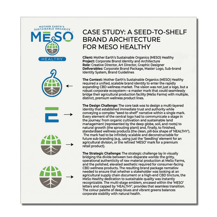
Client: MeSo Healthy
Project: Corporate Identity & Brand Architecture
Role: Creative Director, Art Director, Graphic Designer
Deliverables: Corporate Brand Package, Master Logo, Sub-brand Identity System
The Context: As MeSo Healthy prepared to enter the rapidly growing CBD wellness market, they required a robust corporate brand that went far beyond a single product. The vision was a comprehensive ecosystem: an overarching corporate identity that would seamlessly branch into several distinct wellness product lines, as well as extend to "MeSo Farms," their owned-and-operated agricultural division responsible for producing the raw materials.
The Design Challenge: The core objective was to design a highly scalable and versatile brand architecture. The master logo and visual identity needed to establish immediate trust, sophistication, and wellness authority for MeSo Healthy as a corporation. Simultaneously, the design system had to be flexible enough to adapt into distinct sub-brands for varying product lines without losing its core visual DNA.
The Strategic Challenge: Connecting the dots from soil to shelf presented a unique branding hurdle. We had to create a cohesive visual language that bridged two very different worlds: the earthy, operational authenticity of raw material production at MeSo Farms, and the polished, elevated aesthetic required for consumer-facing wellness products. The resulting brand package needed to ensure that whether a stakeholder was looking at an agricultural supply chain document or a premium retail CBD tincture, the MeSo Healthy commitment to quality was instantly recognizable.
Design Evaluation: The Visual Language
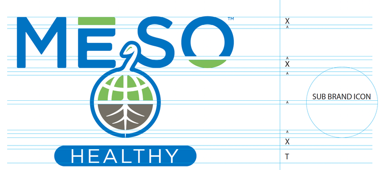
As seen in the visual analysis, the logo is remarkably successful because it captures a complex, multi-stage narrative within a single, cohesive mark. The deconstructed elements show that we were successful in designing a visual system.
Integrated 'Seed' Concept: The way the plant sprout and seed leaves form the letters of "MESO"—and the central sprout itself is centered within the main name—instantly establishes the organic, raw material source as the very core of the brand.
The Soil-to-Product Connection: By anchoring the main "MESO" mark with roots extending into the soil and earth below, and then placing "HEALTHY" (the final product goal) in a standardized, pill-shaped capsule at the bottom, the logo perfectly visualizes the transformation from agricultural production at MeSo Farms to finished wellness products.
Color Palette and Symbolism: The choice of blues and greens balances corporate authority and trust (blues) with natural growth and health (greens). It is a highly symbolic yet clean and professional presentation.
Scalability and Future Expansion
The logo demonstrates exceptional scalability. By breaking it down into its constituent parts (the soil base, the plant sprout, and the combined "MESO" mark), the case study can show exactly how the identity system adapts.
Corporate: The complete logo works for the parent company.
Farms Division: The soil-and-roots base could be extracted to create a distinct identity for MeSo Farms.
Retail Lines: The "MESO" letters with the sprout could be used for consumer-facing CBD products, perhaps in a gold or different green to signify premium lines.
Ultimately, the brand work for MeSo Healthy is a analysis in modern, functional symbolism. It successfully bridges the agricultural and wellness market sectors and creates a flexible foundation for unlimited corporate growth.
Evolution of Wellness: Scaling the MeSo Healthy Product Architecture
Project: Product Packaging & Brand Evolution
Role: Creative Director, Art Director, Graphic Designer
Deliverables: Primary & Secondary Packaging, Label Design, Flavor System Development, Premium Line Extension
The Context: Following the successful development of their master corporate identity, MeSo Healthy was ready to bring their "seed-to-shelf" vision to the consumer market. The CBD wellness space is notoriously crowded and visually noisy. MeSo Healthy needed a packaging system that not only stood out on retail shelves but could also gracefully evolve as the company expanded its offerings from foundational wellness goods to premium cosmetics.
The Design Challenge: Our objective was a three-phased rollout. We needed to establish a strong, recognizable footprint for their launch, elevate that aesthetic as the product line matured into flavored variants, and finally, push the brand into an entirely new, high-end cosmetic space—all while maintaining the core MeSo Healthy DNA.
Phase 1
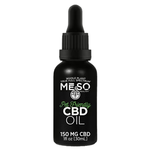
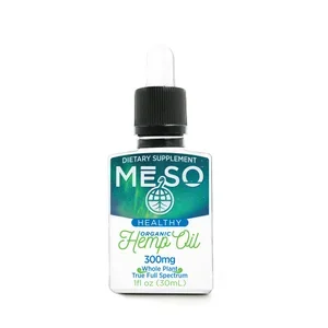
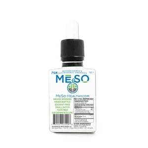
The Go-to-Market Foundation For the initial launch, the goal was to establish trust, transparency, and approachability. We created a comprehensive packaging system across a diverse array of form factors.
The Deliverables: Custom graphics and label systems for glass bottles, metal tins, glass jars, tincture droppers, and all corresponding outer retail boxes.
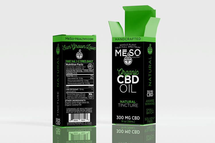
The Aesthetic: The design heavily leveraged the core blues and greens of the master logo. We focused on clear information hierarchy, ensuring consumers could easily navigate dosages, ingredients, and the organic nature of the product. The look was grounded, clinical yet natural, and highly accessible.
Phase 2
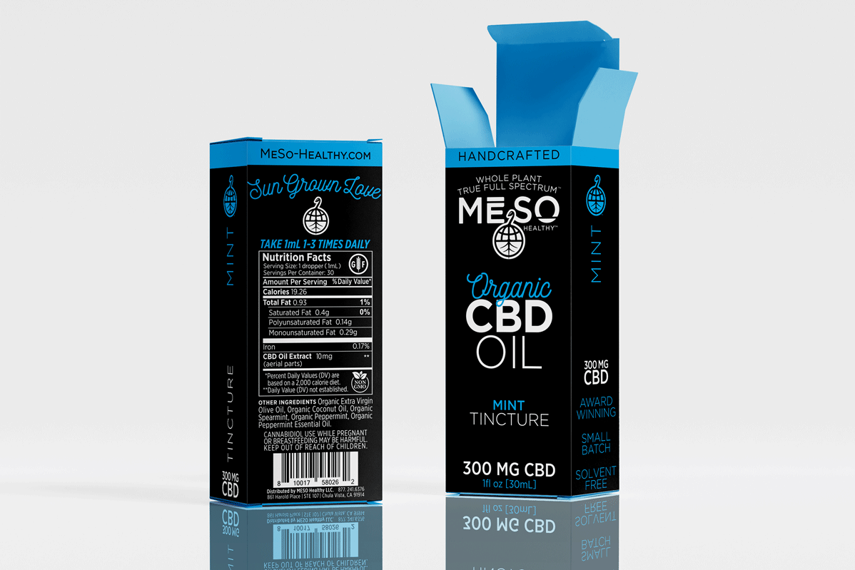
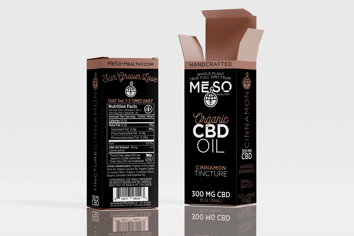
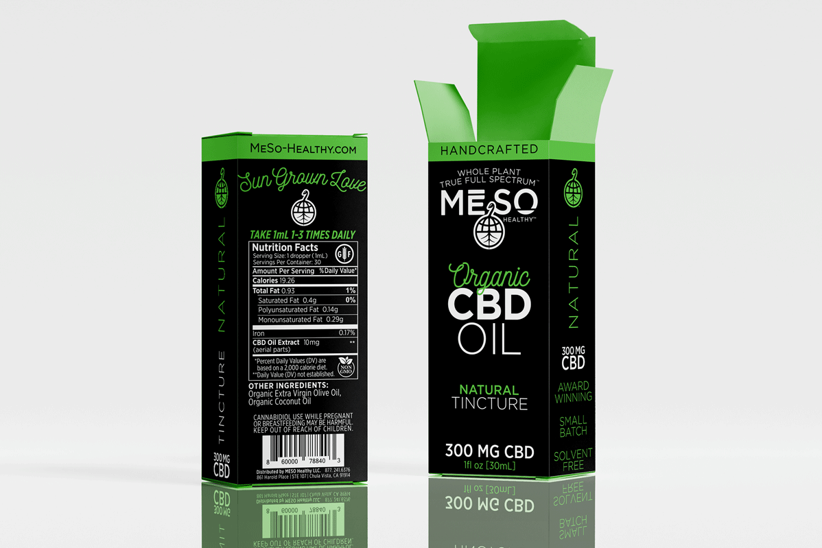
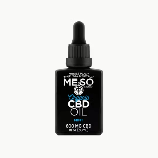
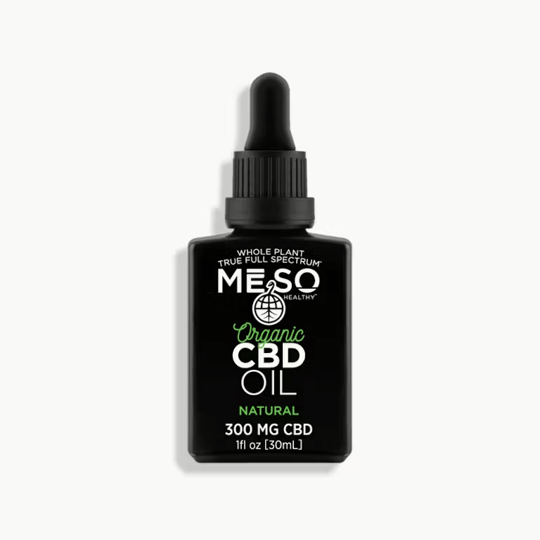
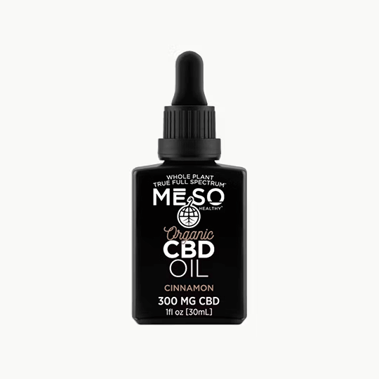
The Sophisticated Pivot As the brand gained traction, MeSo Healthy expanded their flagship tincture line to include three core profiles: Natural, Mint, and Cinnamon. This required a visual leveling-up.
The Strategy: We transitioned the brand to a cleaner, more minimalist presentation. We introduced a sophisticated color-coding system to differentiate the Natural, Mint, and Cinnamon profiles, ensuring the visual palette felt botanical, warm, and refined rather than artificial.
The Aesthetic: By increasing negative space and refining the typography, the tinctures moved away from a strictly "medicinal" look and stepped into a modern, lifestyle-focused wellness aesthetic.
Phase 3
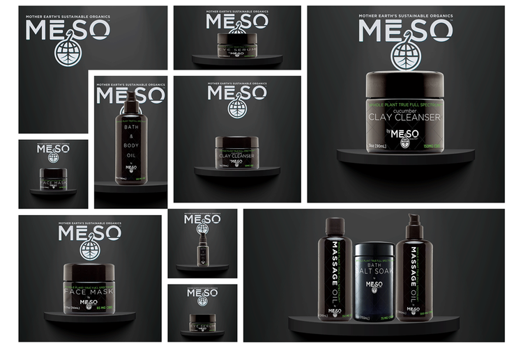
The Top-Shelf Cosmetic Extension The final phase represented the brand's most ambitious leap: extending into the health and beauty sector with a premium, top-shelf product line encompassing bath salts, luxurious lotions, targeted facial serums, purifying clay cleansers, and more.
The Strategy: We needed to compete not just with other CBD brands, but with established, high-end skincare and beauty products. The packaging had to feel luxurious, giftable, and deeply efficacious across a wide variety of distinct containers, from heavy glass serum droppers to wide-mouth clay jars.
The Aesthetic: We pivoted the design language firmly into the cosmetic realm. We utilized elevated finishes—such as soft-touch materials, metallic accents, and elegant, muted color palettes—alongside whisper-quiet typography. The MeSo Healthy logo was treated less like a corporate badge and more like a high-fashion hallmark, signifying quality and purity in the luxury beauty space.
The Result
The phased packaging strategy allowed MeSo Healthy to capture a broad initial audience and gently guide them toward higher-end, specialized products. The cohesive yet flexible design system proved that a brand rooted in agricultural authenticity could seamlessly compete on the shelves of luxury beauty retailers.
Strategic Collaborations:
Scaling the Brand Experience
The Partnership: To bring the MeSo Healthy brand into the physical world and arm the sales team with the right tools, we partnered with BLT Marketing, a highly respected staple in the San Diego media ecosphere.
The Objective: As Creative Director, my goal was to ensure our meticulously crafted visual identity translated flawlessly into large-scale experiential marketing and comprehensive sales materials. While we owned the brand's visual and strategic DNA, we needed to leverage BLT's extensive logistical and production expertise to execute on a massive scale.
The Execution: Our collaborative efforts were focused on two primary touchpoints: B2B sales empowerment and B2C experiential marketing.
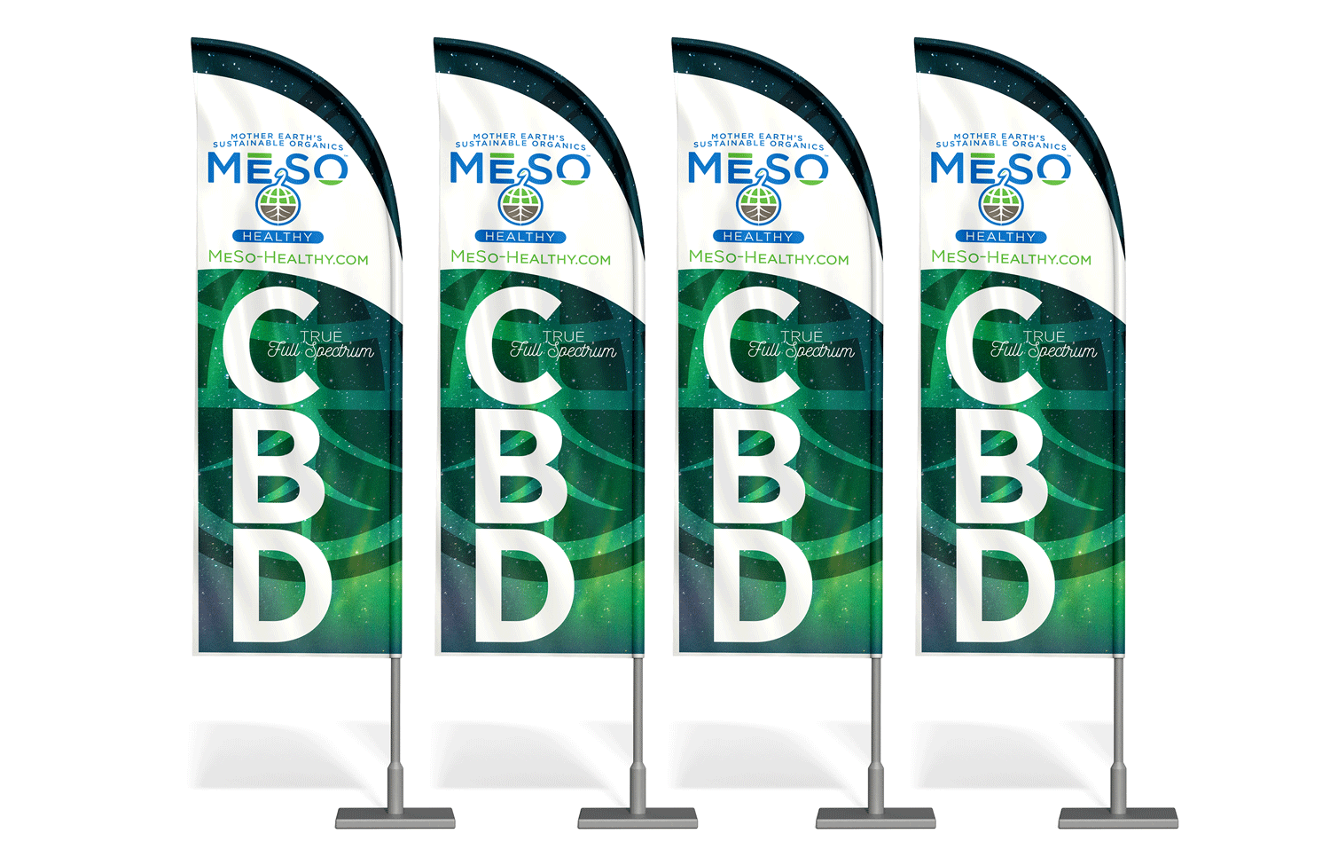
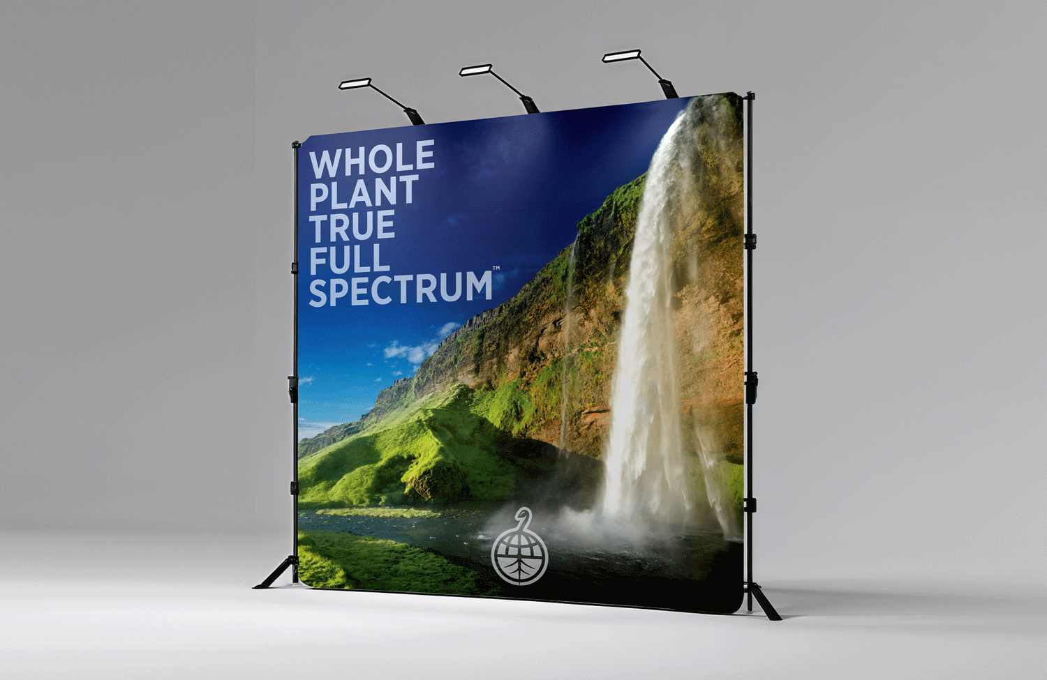
Expandable Sales Collateral: We designed and developed a highly modular sales and marketing collateral system. Because the MeSo Healthy product architecture was constantly expanding—from foundational tinctures to the high-end cosmetic line—this system needed to be easily adaptable. It provided the sales team with a cohesive, premium suite of materials to confidently pitch to both local boutiques and major retail distributors.
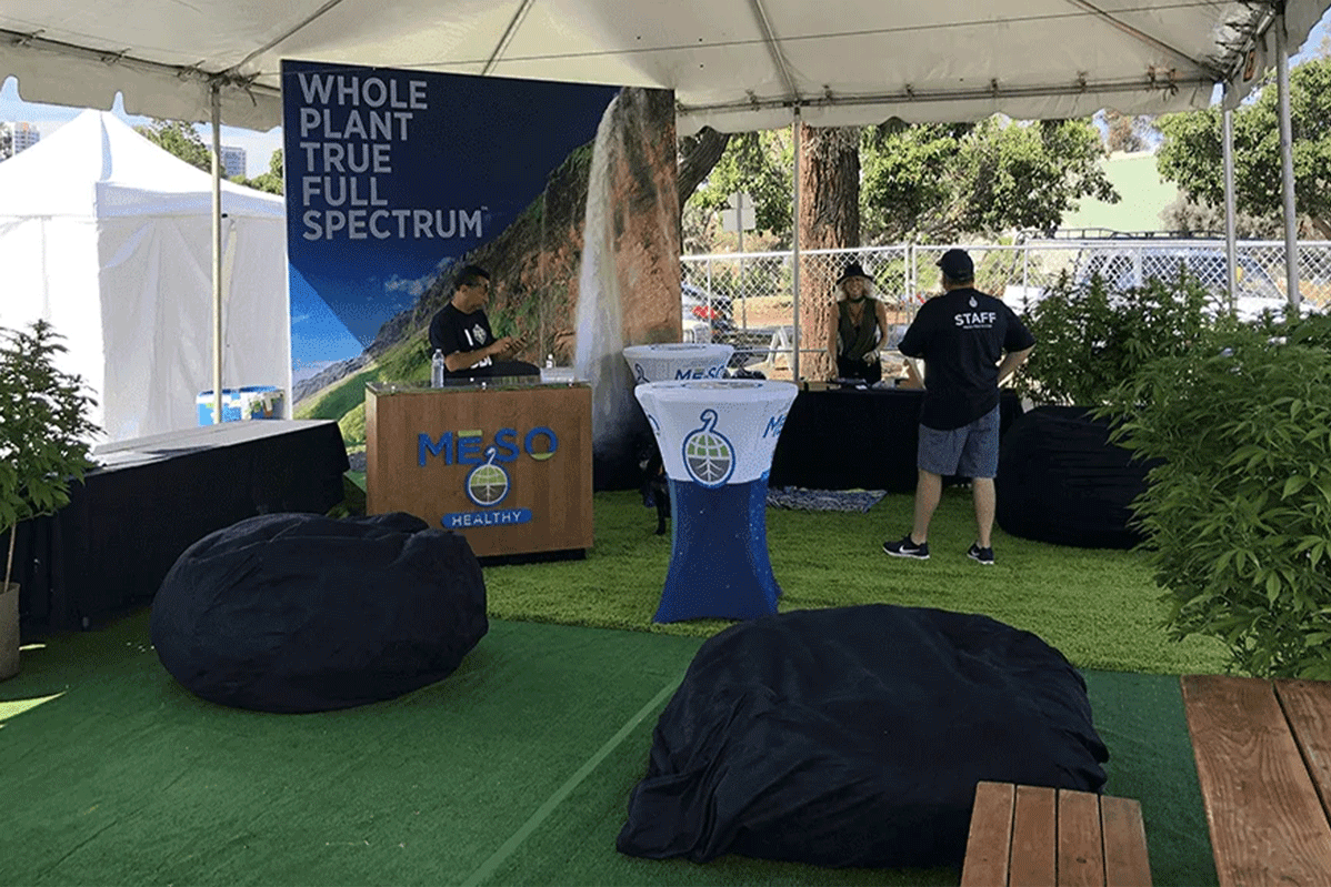
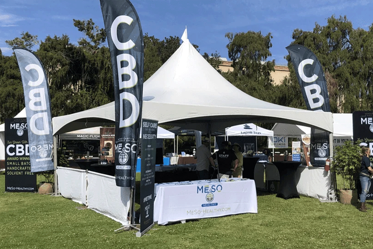
Large-Scale Event Activation (Balboa Park Earth Day): The pinnacle of this partnership was our physical activation at Earth Day in Balboa Park. By combining our brand vision with BLT’s event production capabilities, we designed and executed a large-scale, multi-booth promotional experience. This immersive, high-traffic setup allowed consumers to experience the brand's "seed-to-shelf" journey and sustainable ethos firsthand in a highly engaging environment.
The Result: This strategic collaboration effectively bridged the gap between packaging design and real-world brand presence. By leaning into BLT Marketing's strengths in event logistics, we successfully established MeSo Healthy not just as a premium product on a shelf, but as a dynamic, community-engaged wellness brand.
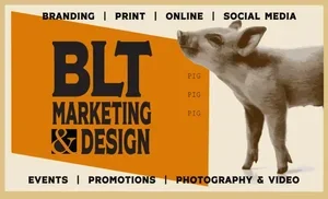
Check out our Friends at BLT!
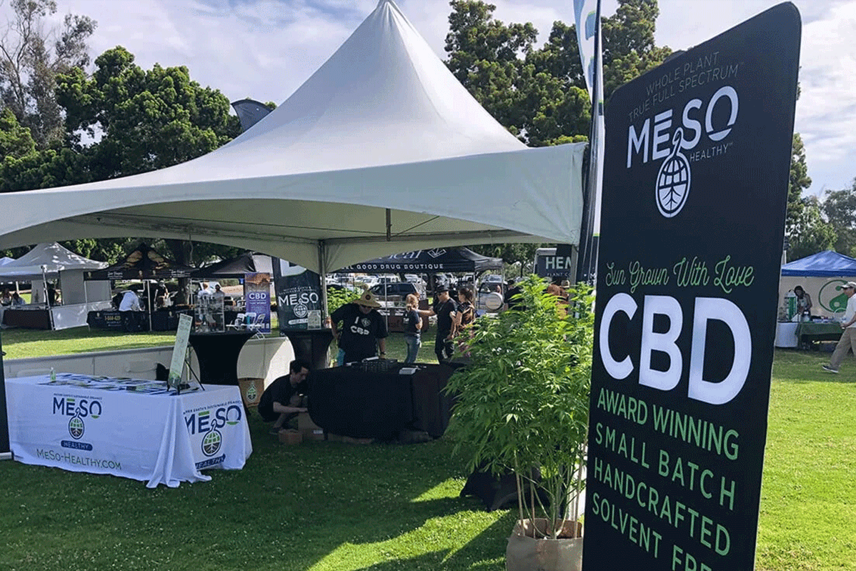
Event images courtesy of BLT Marketing.